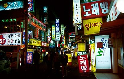
(Small businesses) Campaign for better looking signboards
| Joongang Ilbo is campaigning for better looking (more beautiful, arûmdapta) business signboards. There's no denying that having some order in the signboard (kanp'an) wilderness of Korea would make some sense - but on the other hand the disorderliness of the street scenery is also a part of the charm, going beyond the ideas of "beautiful" and so on. Joongang writes of the results of signboard renewal in Noyu Street near Kôn'guk (Konkuk) Unversity. The plan for the experience was made in 2001; the number of sigboards was limited to two per shop (as if two wouldn't be enough), one wallboard (?) and one protruding board. The size of the boards was limited, and red color (pulgûn saek) was forbidden. 노유거리 바꾸기 사업은 사실상 2001년 시작됐다. 우선 간판은 가게당 벽면간판 1개, 돌출간판 1개로 제한하고 붉은색 간판은 금지시켰다. 간판 글씨는 전체 간판 크기의 8분의 3을 넘지 않도록 했다. 한전 분전함과 전신주 등 도로 적치물은 치워지거나 지하로 들어갔고 보도블록도 예쁘게 단장했다.The shopkeepers resisted at first, but now after one year, the results are reported to be good. Sales have gone up, as well as the premiums (kwôlligûm). ("Premium" is the price of the business besides the shop space that is paid when a shop or a business space changes the occupant. It has no legal base, and it has formally nothing to do with the property owner, transacted only between the shopkeepers.) "Land price has doubled since the renewal, and shop 'premium' which used to be 30-40 million won can be now as high as 200 million." It is so interesting to see the amount of English-language and Latin character signboards. Cannot help smiling looking at how awkwardly Latin characters fit into the protruding signboards - it really seems one cannot do without them. I guess the street scene in the picture to the left is an improvement over what it was before, but I really cannot think of it as that different from other places. And the red color; I know I don't get the difference between ppalgan saek and pulgûn saek, but I see quite many red signboards. Perhaps the regulations have been followed in a creative and selective manner... ("Commie" is ppalgaengi and "Red Square" is Pulgûn kwangjang, so I guess Koreans either don't have that much distinction between the reds.) Anyway, good luck for Joongang in its campaign. Too bad I don't have a linkable picture of an early 30s cartoon showing a shop with a signboard some three times higher than the building itself, ridiculing the tendency to compete in loudness with signboards.  Sillim 4-geori at night (c) AL 2000 |


Comments to note "(Small businesses) Campaign for better looking signboards" (Comments to posts older than 14 days are moderated)
Write a Comment